It is a fact that if you don’t run your business according to the current market trend there are high chances that you may get out of the league. Since change is the only constant every business has to move accordingly and this calls for detailed market research, future analysis, risk mitigation, and planned implementation.
There are higher chances of conversion rate or lower bounce rate if the website is appealing to the visitors and the content is highly optimized to deliver. It is really important for a content developer and the front end developer to understand that it is not at all important not to put each and everything on a website unless it helps you generate understanding of your business.
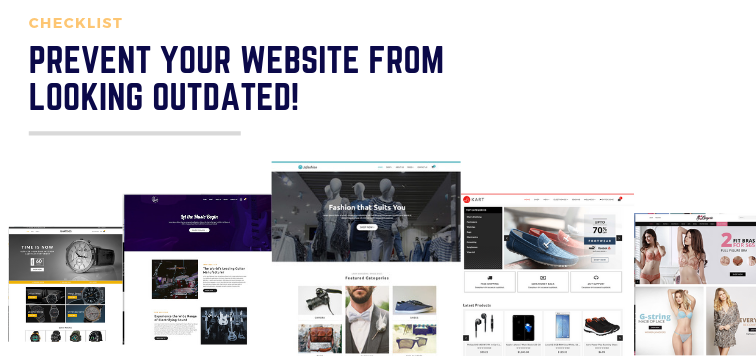
Any website looks revolves around four sorts of parameters. They are Design and Color, Pictures and Graphics, Usability, Consistency. The mentioned parameters are the key source from preventing a website from looking old fashioned.
The effect generated through the communication withhold a huge credibility factor for a company from its customers. No matter if a company is selling a product which resolves a problem which may have not been resolved by any other provider. But what if the content used and the expression of the language used to explain and allure respectively to a customer to buy them is not up to the mark? Will they buy? The answer is obviously, No!
MIND YOUR LANGUAGE
A customer may weigh the cost factor lower even if some other manufacturer is selling the same product on their website, if the appeal is made correctly. Your brand, packaging, brand statement, product or service, and idea should communicate care, trust, and quality. In research by Stanford, 46% of visitors agree that they make the judgment to buy or be there on a webpage only just by looking at the color scheme, font and font size, layout, site navigation, and images used.
In fact, 3M has to say that a human brain processes the visual on a website 60,000 times faster than text. Hence, with a second a visitor can make a decision whether they can trust the website or not purely based on what they see and their brains interpret rather than what the content you have to say.
DESIGN AND COLOR
A website developer has to be very particular about the color scheme they are going to apply for the whole website. Maximum of 3-4 colors are required to create a website in conjunction with each other. Colors provide an instant layer of communication. Even before the conscious mind has started thinking about the content and decide whether they have landed on the right page or not, the subconscious mind has already assessed if something is interesting and worth time spending or not.
Researches have revealed, it takes only 90 seconds for a subconscious mind to make a decision about the website and the product (if any) within. Within that span, 62% to 90%assessment is based on color scheme applied.
 Source - Picture Creative
Psychology of the colors has to say, 84.7% of website developer consider that site color is the primary reason those customer asses and use to decide whether to stay on a website or not. Moreover, when people buy, 93% of customers look at the visuals, 6% at the texture, and 1% at the sound and smell.
PICTURES AND GRAPHICS
Make a point that you should use only those images on which you have your own copyright. Avoid using the free licensed images as they are anonymous and are already widely used on every second website of same domain. Refrain, we repeat, refrain from using any proprietary image of any other company because it may lead to serious legal copyright issues.
Get genuine and real images. Hire a photographer that could get you some of the exquisite images which you can post on your webpages. Trust us, this is a good sign of showcasing that you are trustworthy.
Most importantly, hiring a photographer to get the authentic images will not only blow your competition away but will also communicate how much particular is you and your brand about care, quality, and perfection.
USABILITY
Keep things easy to read and understand. Refrain from giving an abbreviation name, what they say, yeah ‘AKA’. let's say, don’t name ‘Join The Pub’ instead of ‘Blog’ or ‘Welcome to the Lobby’ instead of ‘Home’ page.
Make your UI components like buttons and navigations distinct. The menu should be clear and sober. The layout should put the emphasis on what is more important to showcase. Special attention should be given to the content on the live site.

CONSISTENCY
Be consistent with the color scheme, layout and the font specifications you have opted for your store. Don’t violate that.
If still confused, connect to the our experts. We would help you get the right way to develop and maintain a website without getting it outdated.
Or check out our templates for your next online store here!
Also Read: 2019 Top Trends for your Online Store!


