Datasheet Global Configurations
Written by: Indresh Maurya
Date: 28-10-2020
Compatibility: Sellacious v2.0.0-Beta1+
Datasheet Global Configurations are as follows-
1.Distiman Filter Module
2.List Page Options
3.Category Header Layout
4.List page style
5.Detail Page Option
6.Detail Page Style
7.Config for Related Products
Distiman filter Module
Datasheet Filters Layout: Enable this option to get compact layout of filter module on list page.
Note: Compact layout works well with Manufacturer fiter, attribute filter and Submit by Apply button options. Attributes will show in module if only they are filterable. We can show/hide individual attribute filters(global/product/variant or all) in module. To know more about sellacious filter go to Filter Configurations
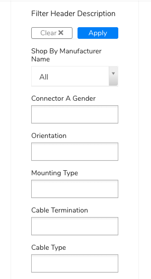

Header Description: This form can be used to show a description text over filter module.
List Page Options
These are the list page options to show in datasheet. These option can be ovverriden at category level-
Datasheet Columns: You can opt what column to show.
Image- Image of product
Product- Title of the product
Part NO.- SKU of product
Pdf- Product Attachment
1 Piece Price- Best price of product
Lowest Quantity Price- Price of lowest quantity in dynamic pricing
Parice Range- Minimum and maximum price separated by dash
Qty in Stock- Avaialble stock quantity of product
Min Qty- Minimum order quantity
Max Qty- Maximum order quantity
Short Description- Short product description
Global Specifications- Shows global specification columns
Product Specifications- Shows product specification columns
Variant Specifications- Shows variant specification columns
Actions- Shows add to cart, buy now, rfq and quote request buttons based on configuration.
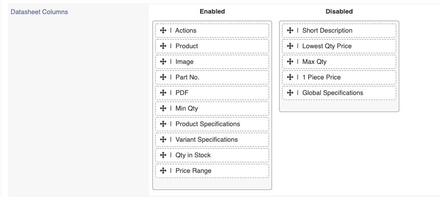

Note List page containing two or more than two categories will show only Filterable global specifications and Category list page will show global and category specific(core+variants) specifications. If all options are disabled then all will show.
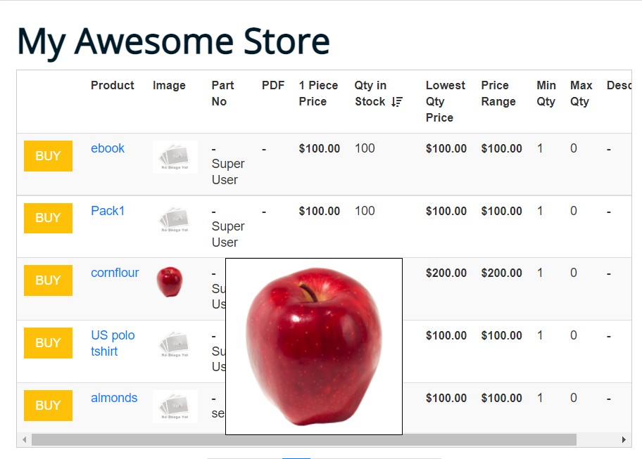
Option to Enable Zoom in images
This Feature lets you enable zoom for images in your layout.
This will only work if the image column is enabled.
Zoomed Image type:
-
Users can select zoomed image type, by choosing either load images from cache or load original images. Zoomed image will come either from cache or direct image depending on the Zoomed Image Type setting.
-
By default zoom config will be enabled and zoom image will load from cache.

-
When load images from original images are selected it will show an option to adjust image width and height.

-
On hovering over the image it will show zoomed image when zoom image is enabled in layout
Datasheet Default Sorting: We can choose Default Sorting for list page datasheet from available options. These options also include Specifications.

Datasheet Sorting Direction: We can choose sorting direction (ascending/discending).
Part Number elements: You can choose Part Number elements wheather it is Product SKU, Seller SKU, Seller Name or all.

Disable Hotlink in List: Link to product details page can be disabled and can be shown as read only.
Default List Limit: We can set no. of products on list page under one pagination.

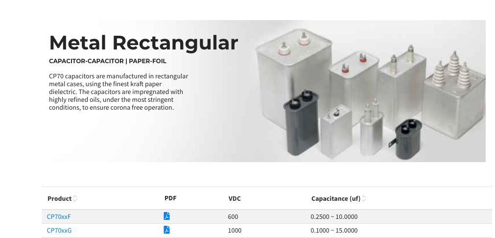
Category Header Layout
Additional options are provided to configure the category page head layout.
Category Head Layout: Choose categoty head layout to be distiman or default.
Show Category Image: Show hide category image.
Category Image Styling: Choose wheather category image should behave as background.
No. of Images: Choose wheather to show image galery in case you have multiple category images.

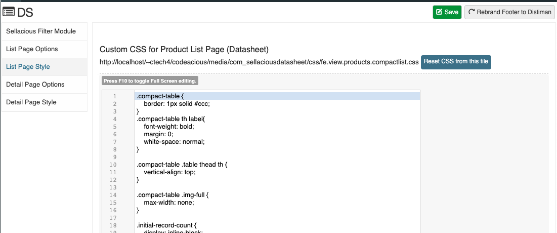
List page style
css of list page can be changed from here and can be reset to default at any time.
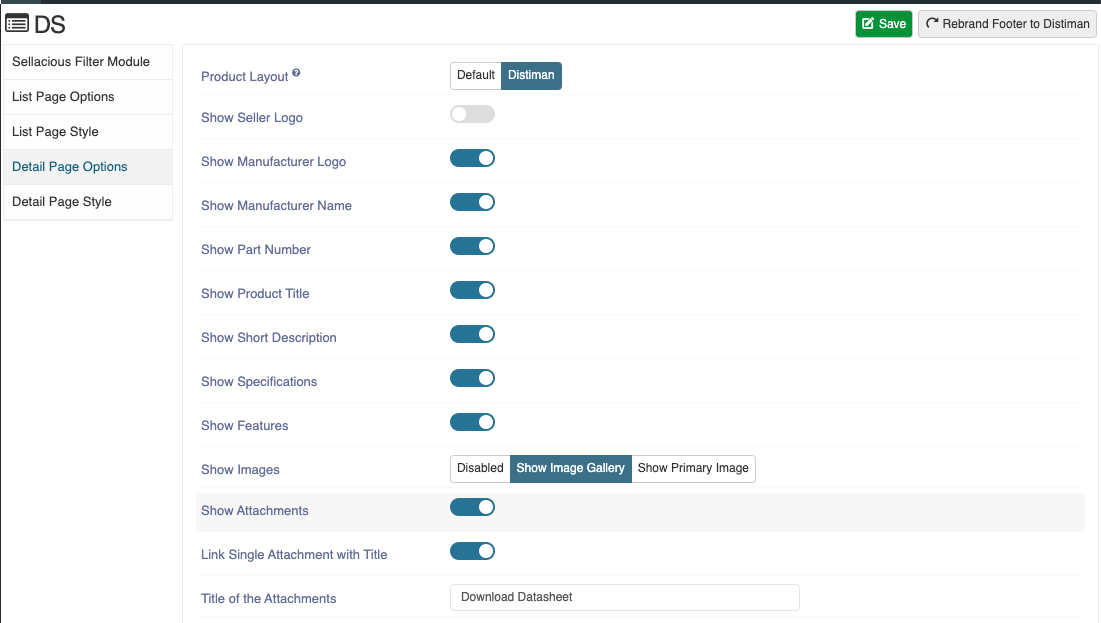
Detail page option
You can manage detail page element from here
Product Layout: Choose which layout should be used in Product Detail Page.
Show Seller Logo: Show/hide seller Logo.
Show Manufacturer Logo: Show/hide Manufacturer Logo.
Show Part Number: Show/hide Part Number.
Show Product Title: Show/hide Product Title.
Show Short Description: Show/hide Short Description.
Show Specifications: Show/hide Specifications.
Show Features: Show/hide Features.
Show Images: Choose between galery and primary image for product.
Show Attachments: Show/hide Attachments.
Link Single Attachment with Title: In case there is single attachment it will show as link.
Title of the Attachments: Give Title to the Attachments.
Show Long Description: Show/hide Long Description.
Show Price List: Show/hide Price List (works only with dynamic pricing).
Title for Stock: Choose what should be title of stock.
Unit for Stock (Text): Choose what should be unit of stock.

Show Tablular List: Show/hide Variants section on details page.
Variants List Columns: Choose what Columns to show in variant section.

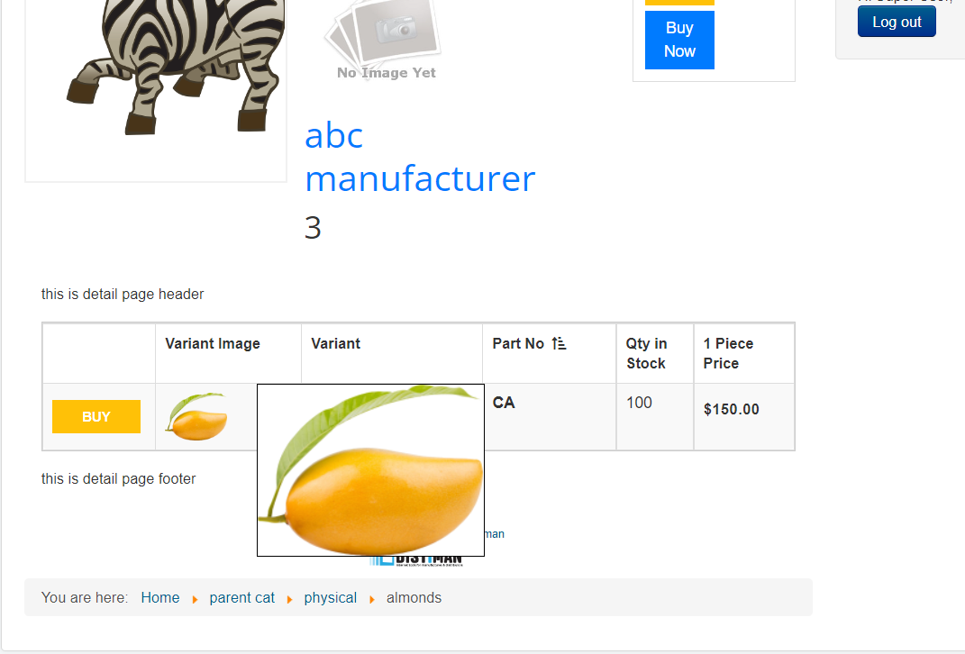
Option to Enable Zoom in images:
This Feature lets you enable zoom for images in your layout.
This will only work if the image column is enabled.
Zoomed Image type:
-
Users can select zoomed image type, by choosing either load images from cache or load original images.

-
When load images from original images are selected it will show an option to adjust image width and height.

-
On hovering over the image it will show zoomed image when zoom image is enabled in layout
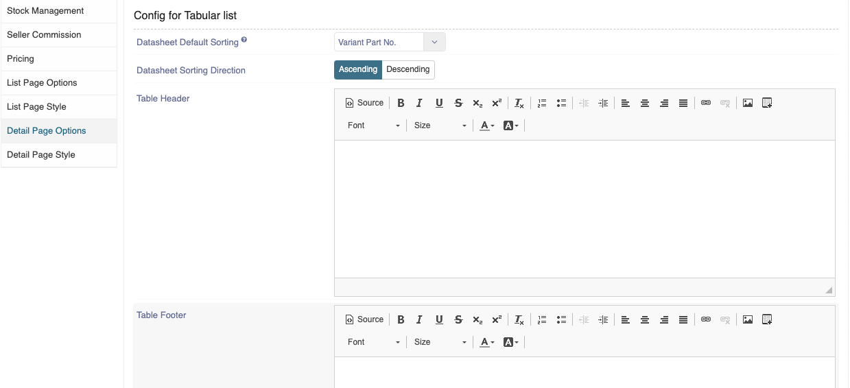
Datasheet Default Sorting: Enables you to set default sorting column for variant section datasheet.
Datasheet Sorting Direction: Chose sorting direction (ascending/discending).
Table Header: Show/hide List Header.
Table Header: Show/hide List Footer.
Detail page style
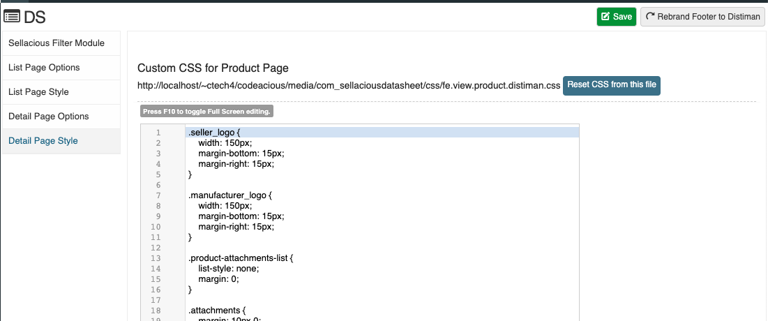
css of Detail page can be changed from here and can be reset to default at any time.
Config for Related Products
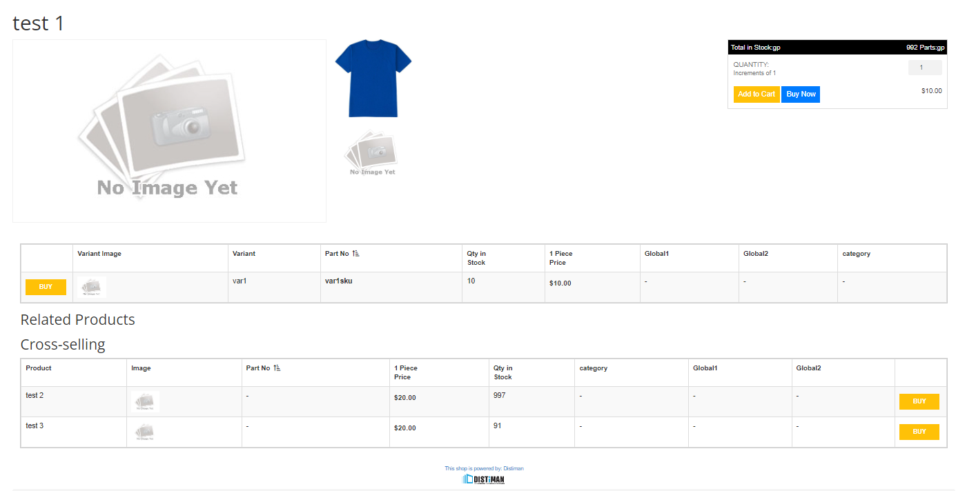
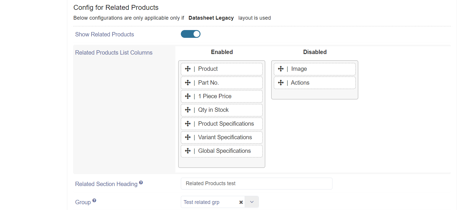
These config for related product table on datasheet details page in category edit.
(Refer to https://www.sellacious.com/learn/product/related-groups on how to create a related group and assign it in a product)
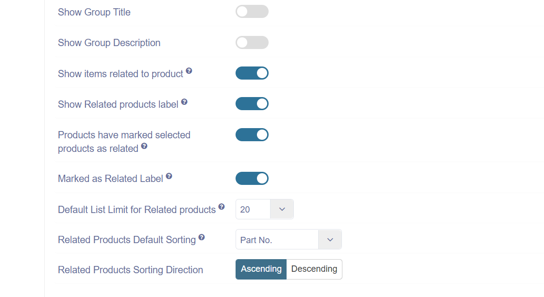
Show Related Products: These config is to enable the related product table on product details page.
Related Products List Columns: Here we can choose what columns to show in related products table.
Related Section Heading: Heading saved here will be shown above related product table.
Group: If selected, then list will show related products from this group only. If nothing is selected, then all related groups will be shown with their respective products.
Show Group Title: This can be use to show/hide related group title above related products table on details page.
Show Group Description: This can be use to show/hide group description above related product table on details page.
Show items related to product: This config to show/hide related product on parent product details page. (this config is not applicable when related group is collection type)
Show Related products label: This config to show/hide related product label on parent product details page. (this config is not applicable when related group is collection type)
Products have marked selected products as related: This config to show/hide related product on children product details page. (this config is not applicable when related group is collection type)
Marked as Related Label : This config to show/hide Marked as Related Label on children product details page. (this config is not applicable when related group is collection type)
Default List Limit for Related products: Here we can select how many product to show in related product table.
Related Products Default Sorting: Select what columns will be default sorting for related product table.
Related Products Sorting Direction: Select the sorting direction for the default sorting column in related product table.
